Afew days ago I ashamedly found myself taking one of those silly quizzes – the same kind that, when my friends share on Facebook that they are a Miniature Pincher in a “What Kind of Dog Are You?” quiz, leads me to roll my eyes and mentally tsk at how far we’ve fallen. Yet here I am, admitting to doing the exact same thing. But this one – What Font Are You? – I just couldn’t resist!
*insert your own eye roll here*
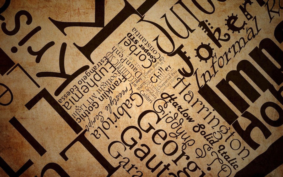
Unless you are an uber-nerd like I am, you’ve probably never given a second thought to fonts. But luckily for you, I have – because believe it or not, fonts matter!
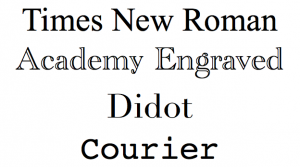
4 Examples of Serif Fonts
There are 3 important factors to keep in mind when choosing a font:
- Legibility – Serif vs. San Serif
- Font Types/Personalities
- Font Sizes
“Serifs” are those little lines along the edges of letters. The most commonly-used serif font is Times New Roman, created in 1931.
“Sans” literally means “without.” Sans Serif fonts are without those little lines. A prime example of a sans serif font is Helvetica. You’ve seen it on every single governmental road sign: “Speed Limit 55”,
“Yield to Pedestrians”, “Miami 63 miles”, all Helvetica.
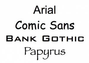
4 Examples of San Serif Fonts
While heavily debated by people who are larger uber nerds than I am, it is commonly accepted that serif fonts are preferred for printed text, while sans serif fonts are ideal for electronic text. If we, as business owners, put so much work into our copy, we wouldn’t want to lose readers because we picked a font that was hard on the eyes.
We also wouldn’t want to pick the wrong type of font. Referencing the font examples on the right, you wouldn’t use Papyrus when composing your resume, and you wouldn’t use Courier on Sally’s 1st birthday party invitations.
Take for example, Comic Sans. It is a font often seen in everything from advertisements, to email from friends, to notes on the community refrigerator at work, kindly asking you not to eat your coworkers’ food items. People tend to choose Comic Sans when they want to appear polite, cutesy, fun. In the professional world, however, Comic Sans makes a lot of people gag (myself included).
Just something to keep in mind.
To finish out our 3 factors, the importance of font size cannot be over-emphasized. All electronic text (like text on your website) should be a minimum font size of 13px. You know how special promotions always have that fine print at the bottom, that’s in an unbelievably small font size? That’s done on purpose because the advertisers know it’s hard to read! Make your font sizes nice and fat and large so that even your “Gam-Gam” wouldn’t have trouble reading it.
Don’t lose readers and potential customers because your message was lost in your font. Share your message with the world in a font type and size they will be happy to read.
Would an inappropriate font on a resume affect whether or not you would hire the applicant?
 Amanda Mili
Your Business, By Design
Ottawa, Ontario – Serving Canada and the U.S.
email: [email protected]
website: www.amandamili.com
Thanks for this article, Amanda!
A useful piece of information I’d like to add : we sometimes hear that either serif or sans serif) is more legible, that one of them works better for titles, or print documents, or Web pages… That’s actually a myth! In reality, both are as legible.
Two sources to find out more:
Alex Poole’s article, “Which Are More Legible: Serif or Sans Serif Typefaces?” The conclusion, after looking at 50+ research studies : there’s no difference. The article debunks some myths and shows the flalws in some research. Worth a read.
Karen Shriver (amazing researcher and writing expert) is conducting a systematic review of all research, to see whether common writing guidelines are actually “true.” What she discovered about the serif vs sans serif issue, in brief:
“What the research shows — When resolution is excellent, as it is on most screens and devices nowadays, serif and sans-serif are equally legible and easy to read. Factors that are more important to readability include line length, contrast, and leading.” (quoted by Iva Cheung,
http://www.ivacheung.com/2013/11/karen-schriver-plain-by-design-evidence-based-plain-language-plain-2013/)
Hi Dominique, thanks for the great information and resources! I’ll indeed do some additional research into the serif vs. sans serif issue. It sounds as though, like most things in life, it all comes down to personal preference in the end. Happy you enjoyed the information!
Totally agree with you on Comic Sans, Amanda. Personally I find sans type faces easier to read, and I find Times New Roman the most boring face on the planet. Garamond is better, if you have to have serifs. As a variation-PLUS-improvement on Comic Sans, have you tried Techno Heavy? Mind you – as you so appositely note – context is everything: it’s all to do with the message you wish to convey.
Nice blog Amanda and thanks also to Dominique for the new research.
Thank you kindly, Sandra!
Great article! Fonts are one of my nerdy little passions. And yes, I have both rejected and seen others reject a resume / cover letter based solely on “omg, I cannot READ this!” Resumes in Comic Sans and Papyrus are second only to those with the person’s name in Blackletter, all caps. (shudder)
Haha! I’m glad to know I’m not the only person out there with font pet peeves. Thanks for sharing, Editormum.